Introduction
Hi friends, hope you are doing good. Be safe and healthy.
In this post, I am gonna walk you through the steps on how to implement a SPFx command extension which will remove the title of the modern page in SharePoint without embedding any custom css based on the class or div id’s. You can follow the below steps to create the solution on your own and add some extra business logics based on your requirements or you can also clone the final code from the PnP Extensions Repo from Github.
Focus on the Code
Let us start by creating a new SPFx extension project using SharePoint yeoman generator, before that create a folder where you would like to create the extension.
You can also follow the documentation from Microsoft to create the new extension project.
Build your first ListView Command Set extension | Microsoft Docs
Navigate to the folder and run the below command.
yo @microsoft/sharepoint
The generator will ask you couple of questions,
- Choose the Extensions and Command Extension template.
- Enter the extension name as your solution name, and then select Enter.
- Select Create a subfolder with solution name for where to place the files.
- Select N to allow the solution to be deployed to all sites immediately.
- Select N on the question if solution contains unique permissions.
- Enter the Command set name
- Enter the Command set description
- Choose the framework as ‘React‘
Note: I have used @microsoft/generator-sharepoint version 1.12.1
Once the project is created, make sure the extension is running without any issues. Its better to run the vanilla extension once it is created. Once the verification is done, install the below packages.
The package.json file should look like the below after installing the above packages.
{
	"name": "react-command-showhide-pagetitle",
	"version": "0.0.1",
	"private": true,
	"main": "lib/index.js",
	"scripts": {
		"build": "gulp bundle",
		"clean": "gulp clean",
		"test": "gulp test"
	},
	"dependencies": {
		"@fluentui/react-hooks": "^8.3.4",
		"@microsoft/decorators": "1.12.1",
		"@microsoft/sp-core-library": "1.12.1",
		"@microsoft/sp-dialog": "1.12.1",
		"@microsoft/sp-listview-extensibility": "1.12.1",
		"@pnp/sp": "2.10.0",
		"office-ui-fabric-react": "7.156.0"
	},
	"devDependencies": {
		"@microsoft/sp-build-web": "1.12.1",
		"@microsoft/sp-tslint-rules": "1.12.1",
		"@microsoft/sp-module-interfaces": "1.12.1",
		"@microsoft/sp-webpart-workbench": "1.12.1",
		"@microsoft/rush-stack-compiler-3.7": "0.2.3",
		"gulp": "~4.0.2",
		"ajv": "~5.2.2",
		"@types/webpack-env": "1.13.1"
	}
}
Here I had named my extension as react-command-showhide-pagetitle
Modify the elements.xml which is located in the sharepoint / assets folder. Since there is no properties required, we can remove the default properies. Also, the command has to be available in both ContextMenu and also on the CommandBar.
<?xml version="1.0" encoding="utf-8"?>
<Elements xmlns="http://schemas.microsoft.com/sharepoint/">
    <CustomAction
        Title="ShowHidePageTitle"
        RegistrationId="100"
        RegistrationType="List"
        Location="ClientSideExtension.ListViewCommandSet"
        ClientSideComponentId="6cf5be8e-2ad4-46bb-a7f9-e8152093891e"
        ClientSideComponentProperties="{}">
    </CustomAction>
</Elements>
Modify the ClientSideInstance.xml which is located in the sharepoint / assets folder. Since we are targeting only the site pages library, the ListTemplateId should be 850 and you can also remove the properties, since there is no need.
<?xml version="1.0" encoding="utf-8"?>
<Elements xmlns="http://schemas.microsoft.com/sharepoint/">
    <ClientSideComponentInstance
        Title="ShowHidePageTitle"
        Location="ClientSideExtension.ListViewCommandSet"
        ListTemplateId="850"
        Properties="{}"
        ComponentId="6cf5be8e-2ad4-46bb-a7f9-e8152093891e" />
</Elements>
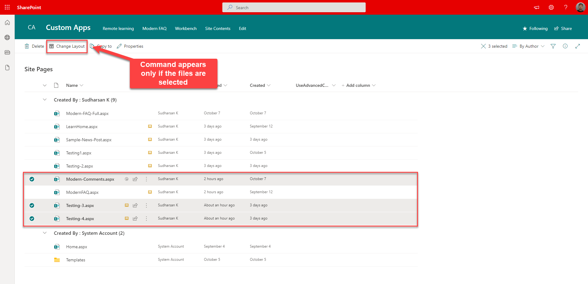
Modify the manifest.json file to give the command properties such as title, iconImageUrl and the type. I have given the command title as Change Layout which will appear both on the command bar and context menu.
{
	"$schema": "https://developer.microsoft.com/json-schemas/spfx/command-set-extension-manifest.schema.json",
	"id": "6cf5be8e-2ad4-46bb-a7f9-e8152093891e",
	"alias": "ShowHidePageTitleCommandSet",
	"componentType": "Extension",
	"extensionType": "ListViewCommandSet",
	// The "*" signifies that the version should be taken from the package.json
	"version": "*",
	"manifestVersion": 2,
	// If true, the component can only be installed on sites where Custom Script is allowed.
	// Components that allow authors to embed arbitrary script code should set this to true.
	// https://support.office.com/en-us/article/Turn-scripting-capabilities-on-or-off-1f2c515f-5d7e-448a-9fd7-835da935584f
	"requiresCustomScript": false,
	"items": {
		"COMMAND_SHOWHIDEPAGETITLE": {
			"title": {
				"default": "Change Layout"
			},
			"iconImageUrl": "<base 64 string>",
			"type": "command"
		}
	}
}
Create a file named IModel.ts in the extension folder. This file will hold all the interfaces.
import { SPHttpClient } from '@microsoft/sp-http';

export interface ICommandInfo {
	List: IListInfo;
	Pages?: IPageInfo[];
}

export interface ISelPageInfo {
	ID: number;
	Title: string;
	Path: string;
	PageLayoutType: string;
	Author: string;
	Editor: string;
	Modified: string;
	Created: string;
	LayoutToUpdate?: string;
	Filename: string;
	CheckedOutBy: string;
}

export interface IPageInfo {
	Name: string;
	Path: string;
	ID: number;
}

export interface IListInfo {
	Title: string;
	Url: string;
	Id: string;
}

export interface ISiteInfo {
	Id: string;
	AbsUrl: string;
	SerUrl: string;
}

export interface IUserInfo {
	DisplayName: string;
	Email: string;
	LoginName: string;
}
Create a folder named components under the extension folder where we will store different functional components files.
Create a file named AppBaseDialog.tsx which will render the dialog with the custom component when the command is invoked.
import * as React from 'react';
import * as ReactDOM from 'react-dom';
import * as strings from 'ShowHidePageTitleCommandSetStrings';
import { BaseDialog, IDialogConfiguration } from '@microsoft/sp-dialog';
import { Dialog, DialogType } from 'office-ui-fabric-react/lib/Dialog';
import { ResponsiveMode } from 'office-ui-fabric-react/lib/Dialog';
import { useBoolean } from '@fluentui/react-hooks/lib/useBoolean';
import { ICommandInfo } from '../IModel';
import { SHPTContainer } from './SHPTContainer';

const modelProps = {
    isBlocking: true
};
const dialogContentProps = {
    type: DialogType.largeHeader,
    title: strings.DialogTitle,
    subText: '',
    showCloseButton: true
};
export interface IAppDialogProps {
    closeDialog: () => void;
    data: ICommandInfo;
}

export const AppDialog: React.FunctionComponent<IAppDialogProps> = (props) => {
    const [hideDialog, { toggle: toggleHideDialog }] = useBoolean(false);

    const _closeDialog = () => {
        props.closeDialog();
        toggleHideDialog();
    };

    return (
        <>
            <Dialog
                hidden={hideDialog}
                onDismiss={toggleHideDialog}
                dialogContentProps={dialogContentProps}
                modalProps={modelProps}
                closeButtonAriaLabel={strings.CloseAL}
                minWidth="900px"
                maxHeight="500px"
                responsiveMode={ResponsiveMode.large}>
                    <SHPTContainer Info={props.data} closeDialog={_closeDialog} />
            </Dialog>
        </>
    );
};

export default class AppBaseDialog extends BaseDialog {
    public data: ICommandInfo;
    public closeDialog: () => void;

    public render(): void {
        const reactElement = <AppDialog closeDialog={this.closeDialog} data={this.data} />;
        ReactDOM.render(reactElement, this.domElement);
    }

    public getConfig(): IDialogConfiguration {
        return {
            isBlocking: true,
        };
    }
}
Above, we have declared two class AppBaseDialog which inherits from the BaseDialog and the AppDialog which will have the actual Dialog component with our custom component named SHPTContainer.
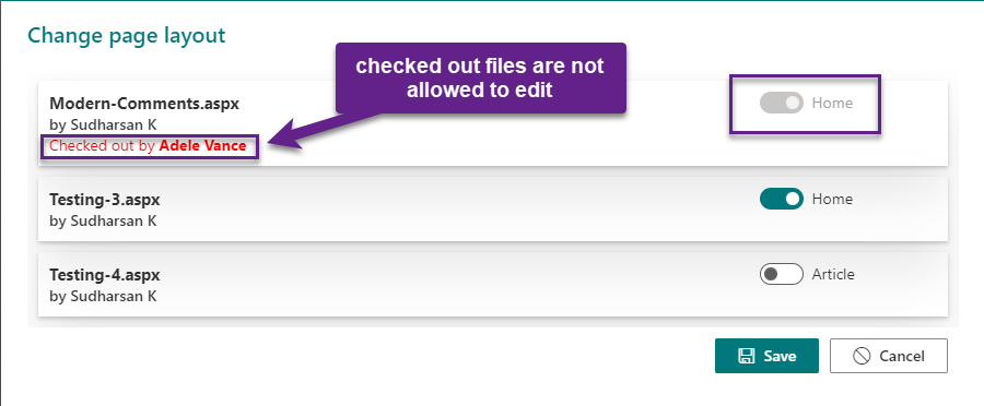
Create a file named SHPTContainer.tsx. This file will hold the entire design of the dialog which will lists the selected pages and their current layout so that the users will be able to change layout of multiple pages at the same time.
import * as React from 'react';
import styles from './common.module.scss';
import * as strings from 'ShowHidePageTitleCommandSetStrings';
import { useEffect, useState, FC } from 'react';
import { useSPHelper } from '../../../Services/useSPHelper';
import { ICommandInfo, ISelPageInfo } from '../IModel';
import { PageTitleToggle } from './PageTitleToggle';
import { Spinner, SpinnerSize } from 'office-ui-fabric-react/lib/Spinner';
import { Stack, StackItem, IStackTokens, IStackStyles, IStackItemStyles } from 'office-ui-fabric-react/lib/Stack';
import { useBoolean } from '@uifabric/react-hooks';
import { MessageBar, MessageBarType } from 'office-ui-fabric-react/lib/MessageBar';
import { DefaultButton, PrimaryButton } from 'office-ui-fabric-react/lib/Button';

const stackTokens: IStackTokens = { childrenGap: 10 };
const footerStackStyles: IStackStyles = {
    root: {
        margin: '10px'
    }
};
const footerItemStyles: IStackItemStyles = {
    root: {
        marginRight: '10px'
    }
};

export interface ISHPTContainerProps {
    Info: ICommandInfo;
    closeDialog: () => void;
}

export const SHPTContainer: FC<ISHPTContainerProps> = (props) => {
    const { getItemInfo, updatePage } = useSPHelper(props.Info.List.Title);
    const [selPageInfo, setSelPageInfo] = useState<ISelPageInfo[]>(undefined);
    const [finalPageInfo, setFinalPageInfo] = useState<ISelPageInfo[]>(undefined);
    const [loading, { toggle: toggleLoading }] = useBoolean(true);
    const [showActionButtons, { setTrue: visibleActionButtons }] = useBoolean(false);
    const [showActionLoading, { setTrue: visibleActionLoading, setFalse: hideActionLoading }] = useBoolean(false);
    const [disableForSubmission, { toggle: toggleButtonForSubmissions }] = useBoolean(false);
    const [msg, setMsg] = useState<any>(undefined);

    const _getSelectedPageInfo = async () => {
        const selInfo: ISelPageInfo[] = await getItemInfo(props.Info.Pages, props.Info.List.Title);
        setSelPageInfo(selInfo);
        setFinalPageInfo(selInfo);
        toggleLoading();
        if (selInfo.length > 0) {
            var filSelPages: ISelPageInfo[] = selInfo.filter(pi => pi.PageLayoutType.toLowerCase() === "article" || pi.PageLayoutType.toLowerCase() === "home"
                && !pi.CheckedOutBy);
            if (filSelPages.length > 0) visibleActionButtons();
        }
    };

    const _onChangeLayoutToggle = (id: number, checked: boolean) => {
        let sourceSelPageInfo: ISelPageInfo[] = finalPageInfo;
        let filPageInfo: ISelPageInfo = sourceSelPageInfo.filter(pi => pi.ID == id)[0];
        if (checked) filPageInfo.LayoutToUpdate = "Home";
        else filPageInfo.LayoutToUpdate = "Article";
        setFinalPageInfo(sourceSelPageInfo);
    };

    const _onSaveChanges = async () => {
        setMsg(undefined);
        toggleButtonForSubmissions();
        visibleActionLoading();
        let pagesToUpdate: ISelPageInfo[] = finalPageInfo.filter((pi: ISelPageInfo) => pi.LayoutToUpdate && pi.LayoutToUpdate !== pi.PageLayoutType);
        if (pagesToUpdate.length > 0) {
            await updatePage(pagesToUpdate);
            let sourcePageInfo = selPageInfo;
            pagesToUpdate.map((page: ISelPageInfo) => {
                let fil: ISelPageInfo[] = sourcePageInfo.filter(pi => pi.ID === page.ID);
                fil[0].PageLayoutType = page.LayoutToUpdate;
            });
            setSelPageInfo(sourcePageInfo);
            setMsg({ message: 'Page(s) updated successfully!', scope: 'success' });
        } else {
            setMsg({ message: 'Nothing to update!', scope: 'info' });
        }
        hideActionLoading();
        toggleButtonForSubmissions();
    };

    useEffect(() => {
        _getSelectedPageInfo();
    }, []);

    return (
        <div className={styles.shptContainer}>
            {loading ? (
                <Spinner label="Loading info..." size={SpinnerSize.medium} labelPosition={'bottom'} ariaLive="assertive" />
            ) : (
                <>
                    {msg && msg.message &&
                        <MessageBar messageBarType={msg.scope === 'info' ? MessageBarType.severeWarning : msg.scope === 'success' ? MessageBarType.success : MessageBarType.blocked}
                            isMultiline={false}>
                            {msg.message}
                        </MessageBar>
                    }
                    {!loading && selPageInfo &&
                        <>
                            <div className={styles.pageContainer}>
                                {selPageInfo.map((page: ISelPageInfo) => (
                                    <div className={styles.pageInfoDiv}>
                                        <div className={styles.titleContainer}>
                                            <div className={styles.title}>{page.Filename}</div>
                                            <div className={styles.authorInfo}>by {page.Author}</div>
                                            {page.CheckedOutBy && <div className={styles.checkedout}>Checked out by <b>{page.CheckedOutBy}</b></div>}
                                        </div>
                                        <div className={styles.propertyDiv}>
                                            {page.PageLayoutType && (page.PageLayoutType.toLowerCase() === "article" || page.PageLayoutType.toLowerCase() === "home") ? (
                                                <>
                                                    <PageTitleToggle LayoutType={page.PageLayoutType} ID={page.ID} onChangeLT={_onChangeLayoutToggle}
                                                        isCheckedout={page.CheckedOutBy ? true : false} />
                                                </>
                                            ) : (
                                                <div>Not supported</div>
                                            )}
                                        </div>
                                        <br />
                                    </div>
                                ))}
                            </div>
                            <Stack tokens={stackTokens}>
                                <Stack horizontal horizontalAlign="end" styles={footerStackStyles}>
                                    {showActionLoading &&
                                        <StackItem>
                                            <Spinner size={SpinnerSize.small} ariaLive="assertive" style={{ marginTop: '7px', marginRight: '10px' }} />
                                        </StackItem>
                                    }
                                    {showActionButtons &&
                                        <>
                                            <StackItem styles={footerItemStyles}>
                                                <PrimaryButton onClick={_onSaveChanges} disabled={disableForSubmission}
                                                    iconProps={{ iconName: 'Save' }} text={strings.BtnSave}>
                                                </PrimaryButton>
                                            </StackItem>
                                        </>
                                    }
                                    <StackItem>
                                        <DefaultButton onClick={props.closeDialog} text={strings.BtnCancel} disabled={disableForSubmission}
                                            iconProps={{ iconName: 'Blocked' }} />
                                    </StackItem>
                                </Stack>
                            </Stack>
                        </>
                    }
                </>
            )}
        </div>
    );
};
Create a new file named PageTitleToggle.tsx. This is a separate component that will maintain the layout of the individual page and will have the onChange event to record the layout of each individual page.
import * as React from 'react';
import { FC, useEffect } from 'react';
import { Toggle } from 'office-ui-fabric-react/lib/Toggle';
import { useBoolean } from '@uifabric/react-hooks';
export interface IPageTitleToggleProps {
    LayoutType: string;
    ID: number;
    onChangeLT: (id: number, checked: boolean) => void;
    isCheckedout: boolean;
}

export const PageTitleToggle: FC<IPageTitleToggleProps> = (props) => {
    const [isEnabled, { setTrue: enablePageTitle, setFalse: disablePageTitle }] = useBoolean(false);

    const _onChangeToggle = (event: React.MouseEvent<HTMLElement>, checked?: boolean) => {
        if(checked) enablePageTitle();
        else disablePageTitle();
        props.onChangeLT(props.ID, checked);
    };

    useEffect(() => {
        if (props.LayoutType) {
            props.LayoutType.toLowerCase() === "home" ? enablePageTitle() : disablePageTitle();
        }
    }, []);

    return (
        <>
            <Toggle onText="Home" offText="Article"
                checked={isEnabled} onChange={_onChangeToggle} disabled={props.isCheckedout} />
        </>
    );
};
Create a new file named common.module.scss. This file will hold all the styles.
@import '~office-ui-fabric-react/dist/sass/References.scss';

.shptContainer {
    .pageContainer {
        overflow-y: auto;
        max-height: 500px;
    }
    .pageInfoDiv {
        display: flex;
        box-shadow: 0 2px 4px 0 rgba(0, 0, 0, 0.2), 0 25px 50px 0 rgba(0, 0, 0, 0.1);
        margin: 10px;
        padding: 10px;
    }
    .propertyDiv {
        width: 20%;
    }
    .titleContainer {
        width: 80%;
        .title {
            font-weight: bold;
            font-size: 15px;
        }
        .authorInfo {
            font-weight: 500;
            font-size: 14px;
        }
        .checkedout {
            color: red;
        }
    }
    .footer {
        margin-top: 15px;
    }
}
Next is to create the service layer. Create a folder named Services in src folder and create a file named useSPHelper.ts which is a custom react hook. It has two methods
- getItemInfo – To get the page information whether it is checked out or not, what type of layout is currently used and other info.
- updatePage – To update the page from the current to the selected layout. There are only 2 layouts used Home and Article. If the layout is Home, it can be changed to Article and vice versa. The template and the web part layout pages are not supported. Also, if the page is checked out, the status and the user who checked out is shown.
import { useCallback } from 'react';
import { sp } from "@pnp/sp";
import "@pnp/sp/webs";
import "@pnp/sp/lists/web";
import { IPageInfo, ISelPageInfo } from '../extensions/showHidePageTitle/IModel';

export const useSPHelper = (listTitle: string) => {

    const getItemInfo = useCallback(async (pages: IPageInfo[]) => {
        let finalResponse: ISelPageInfo[] = [];
        if (listTitle) {
            if (pages.length > 0) {
                let batch = sp.web.createBatch();
                let splist = await sp.web.lists.getByTitle(listTitle);
                let response: any[] = [];
                pages.map(async (page: IPageInfo) => {
                    response.push(await splist.items.getById(page.ID)
                        .select('ID', 'Title', 'PageLayoutType', 'Created', 'Modified', 'Author/Title', 'Editor/Title', 'FileRef', 'FileLeafRef', 'CheckoutUser/Title')
                        .expand('Author', 'Editor', 'CheckoutUser')
                        .inBatch(batch).get());
                });
                await batch.execute();
                if (response && response.length > 0) {
                    response.map(res => {
                        finalResponse.push({
                            ID: res.ID,
                            Title: res.Title,
                            Author: res.Author.Title,
                            Editor: res.Editor.Title,
                            Created: res.Created,
                            Modified: res.Modified,
                            Path: res.FileRef,
                            Filename: res.FileLeafRef,
                            PageLayoutType: res.PageLayoutType,
                            CheckedOutBy: res.CheckoutUser ? res.CheckoutUser.Title : undefined
                        });
                    });
                }
                return finalResponse;
            }
        }
    }, [listTitle]);

    const updatePage = useCallback(async (pages: ISelPageInfo[]): Promise<boolean> => {
        if (pages && listTitle && pages.length > 0) {
            let batch = sp.web.createBatch();
            let splist = await sp.web.lists.getByTitle(listTitle);
            pages.map(async (page: ISelPageInfo) => {
                await splist.items.getById(page.ID).inBatch(batch).update({
                    PageLayoutType: page.LayoutToUpdate
                });
            });
            await batch.execute();
            return true;
        } else return false;
    }, [listTitle]);

    return {
        getItemInfo,
        updatePage
    };
};
Modify the <extension>.ts file. The command will be displayed only if the page(s) are selected. Also, when the page(s) are selected we need to pass some information.
import { override } from '@microsoft/decorators';
import { Log } from '@microsoft/sp-core-library';
import {
    BaseListViewCommandSet,
    Command,
    IListViewCommandSetListViewUpdatedParameters,
    IListViewCommandSetExecuteEventParameters
} from '@microsoft/sp-listview-extensibility';
import { sp } from "@pnp/sp/presets/all";
import * as strings from 'ShowHidePageTitleCommandSetStrings';
import { ICommandInfo, IPageInfo } from './IModel';
import AppBaseDialog from './components/AppBaseDialog';

/**
 * If your command set uses the ClientSideComponentProperties JSON input,
 * it will be deserialized into the BaseExtension.properties object.
 * You can define an interface to describe it.
 */
export interface IShowHidePageTitleCommandSetProperties {

}

const LOG_SOURCE: string = 'ShowHidePageTitleCommandSet';

export default class ShowHidePageTitleCommandSet extends BaseListViewCommandSet<IShowHidePageTitleCommandSetProperties> {
    private appDialog: AppBaseDialog = null;

    private _closeDialog() {
        this.appDialog.close();
    }

    @override
    public onInit(): Promise<void> {
        Log.info(LOG_SOURCE, 'Initialized ShowHidePageTitleCommandSet');
        sp.setup({
            spfxContext: this.context,
            sp: {
                baseUrl: this.context.pageContext.web.absoluteUrl
            }
        });
        return Promise.resolve();
    }

    @override
    public onListViewUpdated(event: IListViewCommandSetListViewUpdatedParameters): void {
        const compareOneCommand: Command = this.tryGetCommand(strings.ShowHideCommand);
        if (compareOneCommand) {
            compareOneCommand.visible = false;
            // This command should be hidden unless exactly one row is selected.
            compareOneCommand.visible = event.selectedRows.length >= 1;
        }
    }

    @override
    public onExecute(event: IListViewCommandSetExecuteEventParameters): void {
        switch (event.itemId) {
            case strings.ShowHideCommand:
                let pagesInfo: IPageInfo[] = [];
                if (event.selectedRows.length > 0) {
                    event.selectedRows.map(row => {
                        pagesInfo.push({
                            Name: row.getValueByName("FileLeafRef"),
                            Path: row.getValueByName("FileRef"),
                            ID: row.getValueByName("ID"),
                        });
                    });
                    let data: ICommandInfo = {
                        List: {
                            Title: this.context.pageContext.list.title,
                            Url: this.context.pageContext.list.serverRelativeUrl,
                            Id: this.context.pageContext.list.id.toString()
                        },
                        Pages: pagesInfo
                    };
                    this.appDialog = new AppBaseDialog({});
                    this.appDialog.data = data;
                    this.appDialog.show();
                    this.appDialog.closeDialog = this._closeDialog.bind(this);
                }
                break;
            default:
                throw new Error(strings.UnkCmd);
        }
    }
}
Thats it, you are done with the coding part and now comes the fun part. Execute the code and check whether you are able to see the command or not.
Happy Coding…
Thanks for sharing this.
Pingback: SPFx – How to handle large list items? | Knowledge Share
Pingback: SPFx – Form Customizer | Knowledge Share
Pingback: PnP React Controls Part 1 – Placeholder Control | Knowledge Share