- Using DateTime control PropertyFieldCollectionData Property Pane Control –> You are here
- Using FilePicker and FileTypeIcon control
- Office UI Fabric react DetailsList & PropertyFieldCodeEditor to show the JSON data
- Office UI Fabric react DetailsList & PropertyFieldCodeEditor to show the CSV data
In this post, I am gonna show you how to use the DateTimePicker control as ‘CustomControl’ type in the PropertyFieldCollectionData property pane controls.
Many of them are aware of Reusable property pane controls and Reusable React controls that are available to us to use in our SPFx solutions. Thanks to the PnP Team and the Community Members for such great contributions. We are gonna look into one of the property pane controls called PropertyFieldCollectionData which is very much used to maintain a list/collection of data within the web part itself. Most of us think why can’t we use this instead of lists? this is a false interpretation and we should not compare this control with the list.
This control allows storing minimal information that can be used by the web part. The information stored within the web part will be gone once we removed the web part. So, the content is temporary as long as the web part is alive, the content is alive. I think that’s enough with the theory, let’s jump into the solution.
I hope those who are familiar with SPFx would know how to create the project and add the dependent npm packages. The following are some of the pre-requisites for the solution to work.
- Used SharePoint Yeoman generator version 1.10.0
- Used @pnp/spfx-property-controls for the property controls
- Used @pnp/spfx-controls-react for the content controls.

- Once the project is created with all the dependencies, add the following imports to the webpart.ts file to use the controls.
- Create a new props along with the ‘description’ props to store the information.

- Return the above defined property to the actual component along with the description.

- Adding the PropertyPaneCollectionData to the getPropertyPaneConfiguration() method as shown below
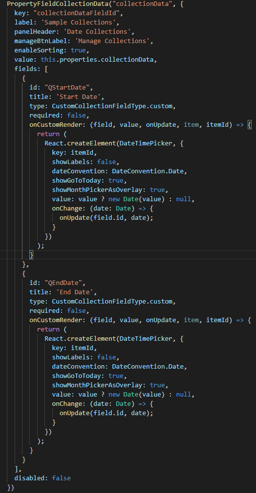
- Below are some mandatory properties that has to be specified for the PropertyPaneCollectionData
- key – Unique id to the pane control
- label – displayed in the property pane
- panelHeader – displayed as a header on the collection data panel
- manageBtnLabel – button text which is displayed in the property pane
- enableSorting – which allows the user to sort the data in the collection
- value – the entire collection data information that has to be stored for further process.
- fields – actual fields that has to be rendered for data collection. Following are the field properties
- id – Unique id of the field
- title – Title that has to be displayed to the end user while adding/updating data.
- type – The type of field that has to be rendered. Based on the selected type, the controls are automatically rendered.
- boolean
- custom
- dropdown
- fabricIcon
- number
- string
- url
- In our case the type has to be ‘Custom‘. Once the custom type is chosen, the onCustomRender has to be defined with the custom controls that has to be rendered.
- In our case the ‘DateTimePicker’ control is returned with the properties associated with the control. Below are few properties that has to be defined to work with PropertyPaneCollectionData
- value – The value to be returned to collection.
- OnUpdate – This method has to be called whenever there is a change in the custom control value. In our case we called inside the onChange event of the DateTimePicker control.
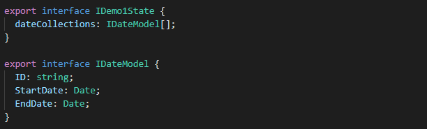
- Create an interface for the state and for the collection data
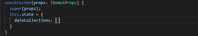
- Declare the constructor and initialize the state value to an empty array.
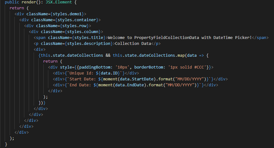
- Since the collected data has been passed to the component as one of the properties of the component, it can be accessed via this.props. Please see the below screenshot on how to process the data.
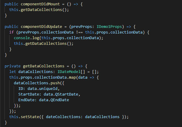
- The data returned to as is an array and this array has been properly assigned to the state with the datatype.
- The below screenshot will show how we can use the ‘moment‘ library to format the data and then displayed it to the user.