Introduction
Modern QuickLinks is the ultimate SharePoint web part that takes your quick links to the next level. While retaining the familiar functionality of the out-of-the-box QuickLinks, Modern QuickLinks offers a range of advanced features designed to enhance user experience and flexibility. Elevate your SharePoint experience with Modern QuickLinks, where enhanced functionality meets modern design.
Note: This is not the replacement of the OOB QuickLinks.
Modern QuickLinks – Microsoft App Source
Features
Customizable Layouts
Modern QuickLinks provides customizable layouts for creative presentations, allowing users to tailor the display of their links in an aesthetically pleasing manner.
Flexible Canvas Support
This web part supports different canvas sizes within the section, section backgrounds, and theme colors, giving users the flexibility to design as per their needs.
Easy Link Maintenance
Links can be easily maintained via a SharePoint list, simplifying management and updates.
User and Global Links Differentiation
The same web part can differentiate between global links and user-specific links based on the current user, ensuring a personalized experience.
User-Friendly Link Management
Users can maintain their links without having to edit the page or navigate to the lists, making it user-friendly and efficient.
Fast Loading with Cache Mechanism
A property to utilize a cache mechanism is available for fast loading of links, enhancing performance.
Sorting Capabilities
Links can be sorted based on a list of fields from the web part properties, offering organized access.
Link Restriction
The feature to restrict the total number of links for users prevents cluttering the section or pages with too many links.
Reusability
Modern QuickLinks can be reused any number of times within the same page or on different pages with the same or different lists, ensuring versatility.
Administrative Options
Administrators have the option to create the required list, providing better control and management.
Support for Full Bleed
You can add this web part like banner in a page which covers the full width of the page.
Icon and Image Choices
Users have the choice to use either fabric icons or images for their links, offering customization and personalization options.
How to Setup
Below are the step-by-step instructions on how to set up the web part and configure its properties to suit your requirements.
License Activation
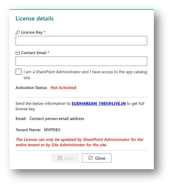
Once you add the web part to the page, you will be displayed with the message to configure the license.

Click Configure License to configure the license for the web part. You must send an email to SUDHARSAN_1985@LIVE.IN with the below details to get the full license. To play around and get hands-on on the web part you can use the trial license given below which is valid for 10 days.
TRIAL LICENSE KEY: tWQD9k5ceFbq2tvdnZr57vaVtH29TbqK6SmLKGnieARdjugYpB
You can follow the below steps to activate the license.
- The license can be activated either by SharePoint Administrator or Site Administrator. If a license is activated by SharePoint Administrator, then it’s a one-time activation for the tenant and the web part can be used in any site collections or site without having to activate it for the individual sites. Site Administrator can activate the license for the web part only for the site. But the same license key can be used to activate for different sites.
- Fill in the License Key & Contact Email and click on Save to activate the license. If you are a SharePoint Administrator, don’t forget to check the checkbox below Contact Email to confirm that you have access to the app catalog site.
- Once the license is saved, you should be able to see the dialog with the activated license like the below
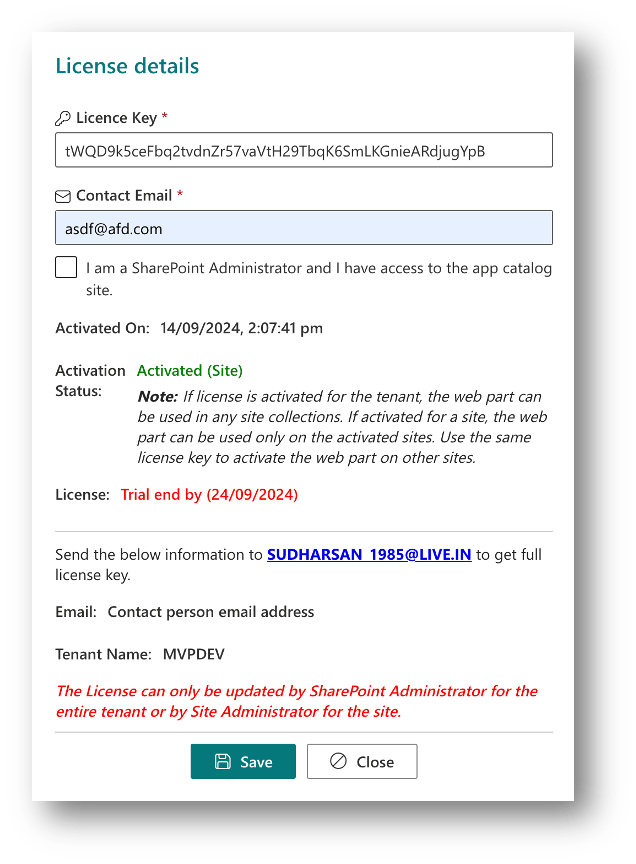
Once the license is activated, you will be able to see the activation status, activation scope whether its tenant or site activation and when the trial ends.
To get the full license, send the below details to SUDHARSAN_1985@LIVE.IN
- Contact Email – Send the same email which is configured in the license form
- Tenant Name – Send the same name which is displayed in the license form
Once the license is configured, you will be displayed with a couple of configurations links like the below screenshot.

Step 1: Create Lists
This step will help you create lists for ‘Global Links‘ and ‘User Links‘, also providing an option to include ‘Sample Items‘ while creating lists. A dialog will be presented when you click on Create List(s) link.

- Give a name for a list where Global Links will be stored.
- Give a name for a list where User Links will be stored.
- Enable to add sample items to the Global Links list.
- Create button to create the list.
- Cancel button to close or cancel the dialog.
Note:
- Both Global & User Links cannot have the same name.
- Each web part can have their own lists. You can create multiple lists based on your requirements. There is no limitation on creating the lists.
List Templates
Both Global & User links follow the same template. Below are the fields that are mapped to the lists
- Title (OOB Field): The title of the link
- URL (Hyperlink): URL to which the user should be navigated when they click on the link. This field has Url & Description. The description will be displayed when they mouse over the link in the Tile design.
- IconName (Single line of Text): You can specify the name of the icon which will be displayed as a link icon. The icon name should be from Office UI Fabric Icon
- IconImage (Image): You can upload the image from your local folder. This field will supersede the IconName field.
- NewWindow (Yes or No): Yes to open the link in a new window, No to open the link in the same window.
- IsActive (Yes or No): This field acts as a soft delete. Only active items are shown to all the users. InActive items can only be accessed from the lists.
- Sequence (Number): You can maintain a sequence for the links to be displayed to the users.
Note:
- User links can be managed directly from the web part by enabling the required configuration.
- When User Links are enabled, users who have access to the web part should have contribute access to the configured User Links list.
- Global links can be managed only from the list.
Exceptions or Errors
When the web part is loaded for the first time, a list named IK-ErrorLogs is created to store errors if any. This will be helpful while troubleshooting the web part when it has some issues. You can also send the error logs to the support email address to analyze and provide a solution to fix the issues.
Permissions
- Global Links: All the users should have read permission to view the links in the home page or any other page where the web part is added. Users who will update the list should have the contribute access to the list.
- User Links: All the users should have contribute access to the list.
- Site Assets: All the users should have contribute access to this library. Images when selected in the list or via the custom form will be stored in this library.
Step 2: Configure Properties
This step will guide you to configure the web part properties and understand the feature mapped to each property. Note: The ‘Configure Properties‘ link will be displayed only when the page is in edit mode. However, the ‘Create Lists’ option can be accessed even if the page is not in edit mode.
General Settings
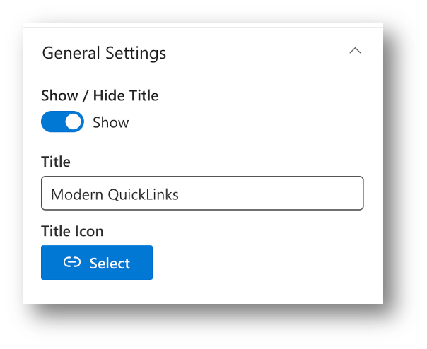
Show / Hide Title:
To display or hide the title for the web part.
Title:
The test to be displayed as title for the web part. When you select the option to show the title, by default the text ‘Modern QuickLinks’ will be displayed, and you can modify to any of your choice.
Title Icon:
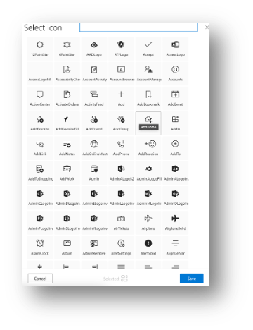
By default, a link icon will be mapped, and it will be displayed to the left of the title. When you click the Select button, a panel with the list of icons will be displayed and you can choose any of the icons from the panel and the same will be displayed in the title bar.
Below is the screenshot of the Modern QuickLinks with customized title bar.

Layout Settings
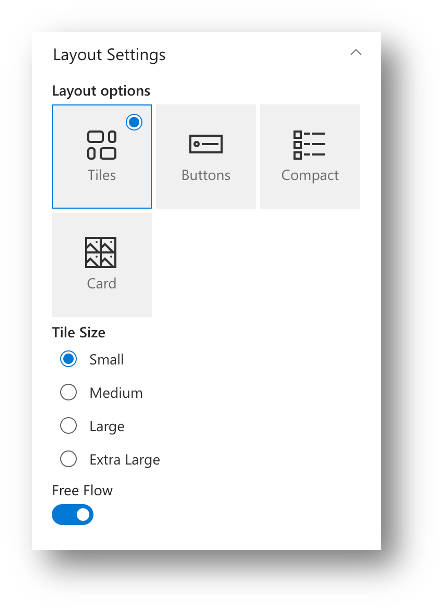
Layout Options:
This option decides how the UI of the links should be.
- Tiles

- Buttons

- Compact

- Card

Tile Size:
This property is available only when the Tiles layout is selected. Below are the different sizes available for the tiles.
- Small
- Medium
- Large
- Extra Large
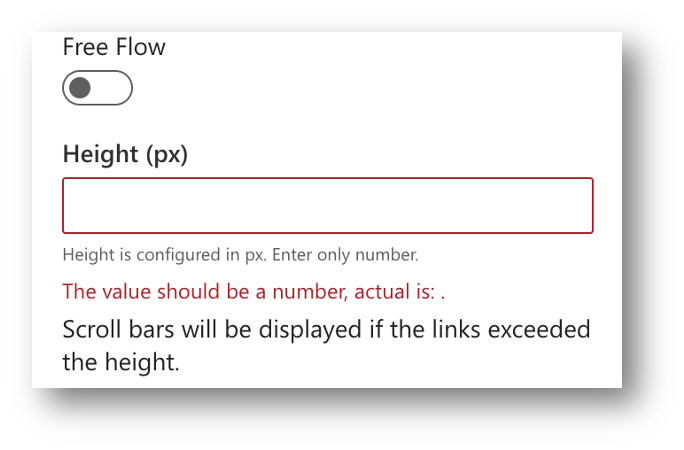
Free Flow:
When this option is selected, the web part size is automatically aligned based on the items shown. When this option is not selected, you are required to provide a height in pixels and provided height will be applied to the web part.
List Settings
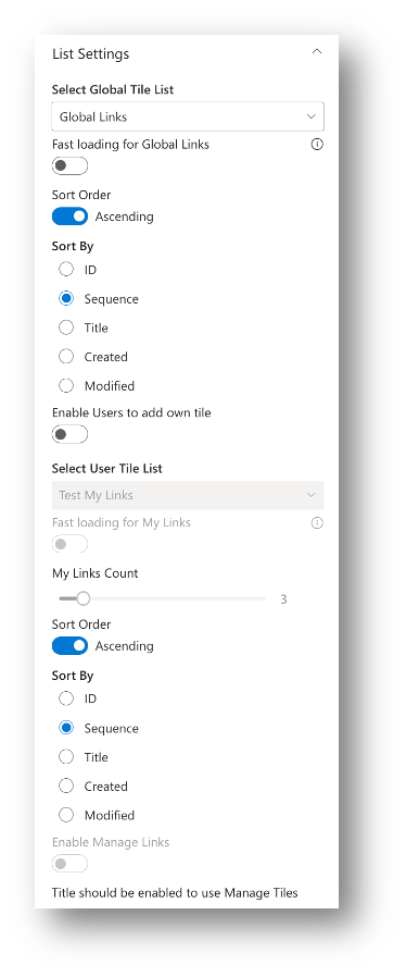
Select Global Links List:
A dropdown with all the lists that are available in the site will be populated. Choose the list that is created at Step 1.
Note: If you are not able to find the lists in the dropdown, please refresh the page and try to choose the list.
Fast loading for Global Links:
Choosing this option will make the use of caching mechanism to load the links from the list. Once the option is selected, when the links are retrieved from the list, it is stored in the browser cache and loaded from the cache when the page is refreshed. By using this mechanism, we avoid multiple transactions to SharePoint list. The cache will get refreshed for every 5 minutes.
Note: Use this option when the links are configured in the list, and it will be updated on a very rare basis.
Sort Order:
Choose ‘Ascending’ or ‘Descending’ for the items to be sorted based on the ‘Sort Fields’ selected.
Sort By
Below are the fields that are available to sort the links for display.
- ID
- Sequence
- Title
- Created
- Modified
Enable Users to add own link:
Enabling this option will allow the users to add their own link and the added link will be mapped to current logged in user and the users can see their own links. So, this will provide an option for each user to manage their own links along with the global links.
Fast loading for User Links:
This is same as Global links option which enables the caching mechanism to load the links and will reduce the transactions to the SharePoint list.
My Links count:
This count will be the maximum limit that the user can add their own links. This will be applicable only to the user links and not to the Global links
Sort Order:
Choose ‘Ascending’ or ‘Descending’ for the items to be sorted based on the ‘Sort Fields’ selected.
Sort By
Below are the fields that are available to sort the links for display.
- ID
- Sequence
- Title
- Created
- Modified
Enable Manage Links:
This will add a manage button to the title bar which will give the users access to their own links in a grid to manage and search for links.
Note: This option is only available if the ‘Title bar’ is enabled for the web part.

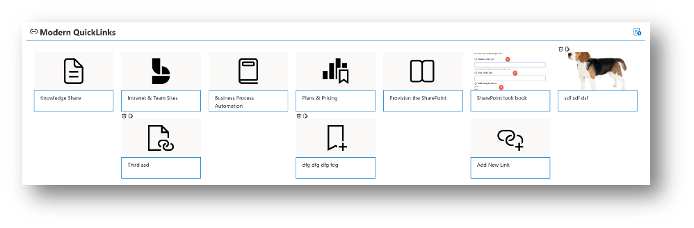
Layout Designs
Once the setup and properties are configured, the web part will load the links from the list(s).


Manage User Links
When user links are allowed, the users should have an option to Create, Update and Delete links. It’s not the recommended solution to give access to the backend list to the end users, some may be cautious, and some may accidentally change something which will result in huge impact. To avoid all those hurdles, the web part provides an easy way to manage their own links.
Add Links
Based on the design, the users are provided with the ‘Add Link’ option. When they click on it, they are presented with the panel to add the link.

- Title: Title of the link
- URL: Url of the link to be redirected to.
- Description: Description of the link. Will be displayed in Tile design when mouse over the link
- Sequence: Display sequence
- Open link in New Window: When the link is clicked, toggle this option to open the URL in the same or different window.
- Icon or Image: Whether to use Office UI Fabric Icon or user defined image to be displayed for the link
- Icon: Based on the selection of the previous option, either the Icon panel or Image panel is opened.
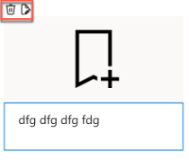
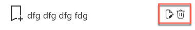
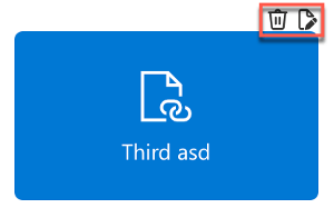
Edit / Delete Links
Users can edit the links directly from the web part without having to edit the page. This is one of the advantages of the web part which enables the links management to the users in a friendly manner. Below screenshot shows the edit option based on the design
When the user click on the Edit link, a panel will be displayed with the link details where the users are allowed to update and save.

Once they save the link, its immediately refreshed in the page without any redirect or reloading of the page.
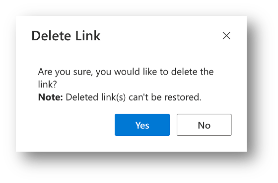
When the users click on Delete, they are provided with a confirmation dialog to delete or cancel the operation. The links once deleted cannot be restored because its a hard delete and not a soft delete.
Conclusion
This web part will be available soon in the Microsoft App Store to download and install in SharePoint sites. You can also download the package from the link provided below to install and try out the app before publishing in the App Store. The trial license is given above and please make use of the trial key and enjoy the feature.
Cheers…
 Knowledge Share
Pingback: SharePoint PnP Viva Connections & SPFx JS SIG Call – June 10th, 2025 – Screenshot Summary - Warner Digital - David Warner II