Introduction
Hi friends, in this post we are gonna learn the usage of PnP SecurityTrimmed control. We will see how we can leverage this control on our SPFx projects and make use of the feature provided by this control. Thanks to the community.
What is PnP Security Trimmed Control?
PnP Security Trimmed Control is a feature within SharePoint that allows administrators to control the visibility of content based on users’ permissions. It ensures that users see only the information and functionalities that they have permission to access. This granular control mechanism is critical in preventing unauthorized data exposure across SharePoint sites, lists, libraries, and other content repositories.
How does the control work?
The control operates by dynamically adjusting the user interface elements based on a user’s permissions. When a user accesses a SharePoint site, the PnP Security Trimmed Control evaluates their permissions against the content’s security settings. Subsequently, it hides or disables elements such as navigation links, menu options, or content snippets that the user does not have authorization to view or interact with.
For instance, if a specific document or folder within a SharePoint library is restricted to certain user groups, the PnP Security Trimmed Control ensures that users who lack the necessary permissions won’t even be aware of its existence. This approach minimizes the risk of accidental exposure of sensitive data.
Key Benefits
- Enhanced Data Security: By selectively displaying information based on user permissions, the control mitigates the risk of unauthorized access to confidential or sensitive content.
- Simplified User Experience: Users see a tailored interface that aligns with their access rights, reducing clutter and confusion by presenting only relevant and accessible content.
- Compliance and Governance: PnP Security Trimmed Control aids in maintaining compliance standards by preventing inadvertent data breaches or unauthorized data access.
- Administrative Control: Administrators can configure security trimming rules to suit the organization’s specific security policies, ensuring a fine-tuned access control mechanism.
Limitations
- Performance Impact: Implementing security trimming involves additional processing overhead. As the control dynamically evaluates permissions for each user, it can potentially impact system performance, especially in large SharePoint environments or during peak usage.
- Complexity in Configuration: Managing security trimming rules and ensuring proper alignment with an organization’s permission structure can be complex. Misconfigurations or inconsistencies in permissions might lead to content visibility issues, making it challenging to maintain an accurate security posture.
- Increased Administrative Effort: Regularly reviewing and updating permissions and security settings to accommodate changes in user roles or content structures requires dedicated administrative effort and meticulous attention to detail.
- Potential for Access Control Errors: Incorrectly configured permissions or overlooking specific user roles can inadvertently grant access to restricted content or hinder access to necessary information, leading to compliance issues or user frustration.
Focus on the Code
You can refer Part 1 post on the creation of the SPFx project and installing all the dependencies. In addition to the dependencies mentioned in that post you have to install @pnp/sp – v3.5.1. You should also do some changes to the project files to make the pnpjs version 3 to work on SPFx 1.14.0. Please follow this link to do the changes.
Created a web part named SecurityTrimmedControlDemo. Below is the SecurityTrimmedControlDemo.ts file.
import * as React from 'react';
import * as ReactDom from 'react-dom';
import { Version } from '@microsoft/sp-core-library';
import {
    IPropertyPaneConfiguration,
    PropertyPaneTextField
} from '@microsoft/sp-property-pane';
import { BaseClientSideWebPart } from '@microsoft/sp-webpart-base';
import { IReadonlyTheme } from '@microsoft/sp-component-base';

import * as strings from 'SecurityTrimmedControlDemoWebPartStrings';
import SecurityTrimmedControlDemo from './components/SecurityTrimmedControlDemo';
import { ISecurityTrimmedControlDemoProps } from './components/ISecurityTrimmedControlDemoProps';

export interface ISecurityTrimmedControlDemoWebPartProps {

}

export default class SecurityTrimmedControlDemoWebPart extends BaseClientSideWebPart<ISecurityTrimmedControlDemoWebPartProps> {

    private _isDarkTheme: boolean = false;
    private _environmentMessage: string = '';

    public render(): void {
        const element: React.ReactElement<ISecurityTrimmedControlDemoProps> = React.createElement(
            SecurityTrimmedControlDemo,
            {
                context: this.context,
                isDarkTheme: this._isDarkTheme,
                environmentMessage: this._environmentMessage,
                hasTeamsContext: !!this.context.sdks.microsoftTeams,
                userDisplayName: this.context.pageContext.user.displayName
            }
        );

        ReactDom.render(element, this.domElement);
    }

    protected onInit(): Promise<void> {
        this._environmentMessage = this._getEnvironmentMessage();

        return super.onInit();
    }

    private _getEnvironmentMessage(): string {
        if (!!this.context.sdks.microsoftTeams) { // running in Teams
            return this.context.isServedFromLocalhost ? strings.AppLocalEnvironmentTeams : strings.AppTeamsTabEnvironment;
        }

        return this.context.isServedFromLocalhost ? strings.AppLocalEnvironmentSharePoint : strings.AppSharePointEnvironment;
    }

    protected onThemeChanged(currentTheme: IReadonlyTheme | undefined): void {
        if (!currentTheme) {
            return;
        }

        this._isDarkTheme = !!currentTheme.isInverted;
        const {
            semanticColors
        } = currentTheme;

        if (semanticColors) {
            this.domElement.style.setProperty('--bodyText', semanticColors.bodyText || null);
            this.domElement.style.setProperty('--link', semanticColors.link || null);
            this.domElement.style.setProperty('--linkHovered', semanticColors.linkHovered || null);
        }

    }

    protected onDispose(): void {
        ReactDom.unmountComponentAtNode(this.domElement);
    }

    protected get dataVersion(): Version {
        return Version.parse('1.0');
    }

    protected getPropertyPaneConfiguration(): IPropertyPaneConfiguration {
        return {
            pages: [
                {
                    header: {
                        description: strings.PropertyPaneDescription
                    },
                    groups: [
                        {
                            groupName: strings.BasicGroupName,
                            groupFields: [
                                PropertyPaneTextField('description', {
                                    label: strings.DescriptionFieldLabel
                                })
                            ]
                        }
                    ]
                }
            ]
        };
    }
}
The only difference in the above code compared to the SPFx generator code is that I had passed context property to the component. The Security Trimmed control requires the context property which is mandatory.
Below is the SecurityTrimmedControlDemo.tsx file
import * as React from 'react';
import styles from './SecurityTrimmedControlDemo.module.scss';
import { ISecurityTrimmedControlDemoProps } from './ISecurityTrimmedControlDemoProps';
import { SecurityTrimmedControl, PermissionLevel } from "@pnp/spfx-controls-react/lib/SecurityTrimmedControl";
import { SPPermission } from '@microsoft/sp-page-context';
export default class SecurityTrimmedControlDemo extends React.Component<ISecurityTrimmedControlDemoProps, {}> {
public render(): React.ReactElement<ISecurityTrimmedControlDemoProps> {
const {
isDarkTheme,
environmentMessage,
hasTeamsContext,
userDisplayName
} = this.props;
return (
<section className={`${styles.securityTrimmedControlDemo} ${hasTeamsContext ? styles.teams : ''}`}>
<div className={styles.welcome}>
<img alt="" src={isDarkTheme ? require('../assets/welcome-dark.png') : require('../assets/welcome-light.png')} className={styles.welcomeImage} />
</div>
<div>
<h3>PnP Security Trimmed Control Demo</h3>
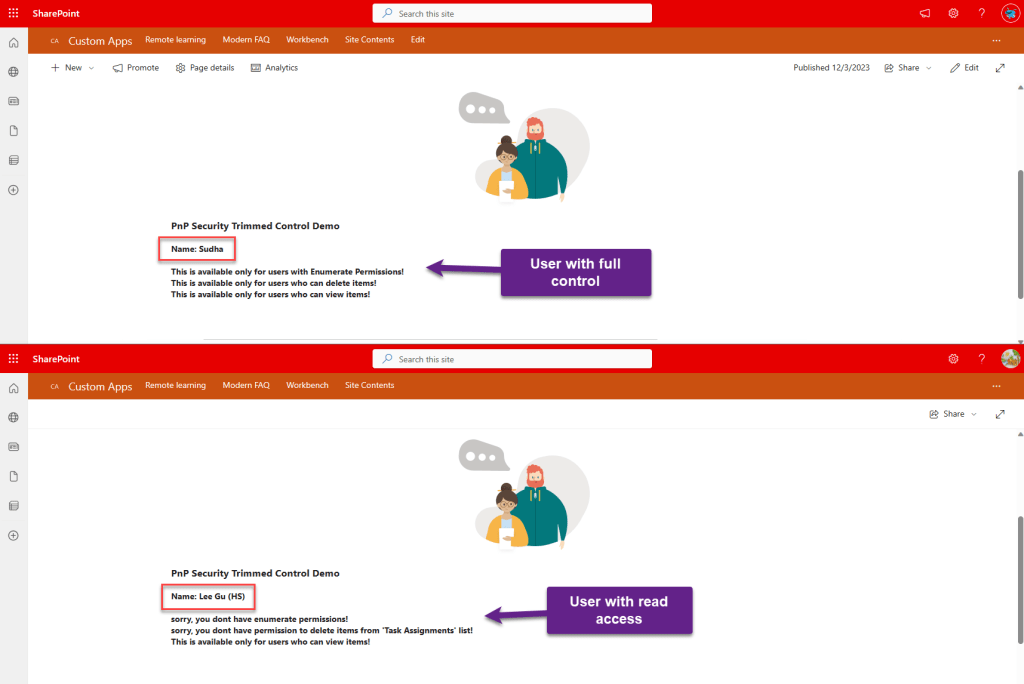
<h4>Name: <b>{this.props.userDisplayName}</b></h4>
<div>
<SecurityTrimmedControl context={this.props.context as any}
level={PermissionLevel.currentWeb}
permissions={[SPPermission.enumeratePermissions]}
noPermissionsControl={<b>sorry, you dont have enumerate permissions!</b>}>
<b>This is available only for users with Enumerate Permissions!</b>
</SecurityTrimmedControl>
</div>
<div>
<SecurityTrimmedControl context={this.props.context as any}
level={PermissionLevel.currentWeb}
relativeLibOrListUrl='/Sites/CustomApps/Lists/Task%20Assignments'
permissions={[SPPermission.deleteListItems]}
noPermissionsControl={<b>sorry, you dont have permission to delete items from 'Task Assignments' list!</b>}>
<b>This is available only for users who can delete items!</b>
</SecurityTrimmedControl>
</div>
<div>
<SecurityTrimmedControl context={this.props.context as any}
level={PermissionLevel.currentWeb}
relativeLibOrListUrl='/Sites/CustomApps/Lists/Task%20Assignments'
permissions={[SPPermission.viewListItems]}
noPermissionsControl={<b>sorry, you dont have read access to the list!</b>}>
<b>This is available only for users who can view items!</b>
</SecurityTrimmedControl>
</div>
</div>
</section>
);
}
}
On the above code, I had used the control thrice with different set of permissions. The content within the control will be display only if the logged in user has those permissions else there will be a default message displayed.
Reference URL
SecurityTrimmedControl – @pnp/spfx-controls-react
Sample Implementation
Conclusion
You should have a clarity on how permissions work and what are all the different permission sets available in SharePoint before using this control. One of the mandatory property is to provide the permission set to validate.
I hope you had learned something about one of the PnP controls. Still a lot to come in future. Stay tuned.
Please free to post your comments and let me know if you want me to post article on any particular feature or plugins that relates to SharePoint. Thanks for your support.
sudharsank/pnpcontrols-demo: Demo project on different PnP React Controls. (github.com)
Happy Coding…
 Knowledge Share