Introduction
Hi friends, in this post we are gonna learn the usage of PnP ListItemComments control. We will see how we can leverage this control on our SPFx projects and make use of the feature provided by this control. Thanks to the community
About the control
I am not sure how many of them are aware of comments that can be added to the list item. Most of them will use the default list view to manage the items and for them adding comments to the item will give more information on the updates done to the item. What if the same has to be maintained from custom component? We can use this ListItemComments control and display the comments for the list item.
Pros
- Readily available control to display the item comments in a modern design
- Configuration is very minimal which makes the devs to configure and use it within minutes
- Nice UI with mentions and delete options
- You can specify the comment size & also a specific comment can be highlighted
Cons
- Configuration expects the List ID, Current Service Scope and Item ID as a mandatory properties.
- Cannot add any custom style
Focus on the Code
You can refer Part 1 post on the creation of the SPFx project and installing all the dependencies. In addition to the dependencies mentioned in that post you have to install @pnp/sp – v3.5.1. You should also do some changes to the project files to make the pnpjs version 3 to work on SPFx 1.14.0. Please follow this link to do the changes.
Created a web part named ListItemCommentsDemo. Below is the ListItemCommentsDemo.ts
import * as React from 'react';
import * as ReactDom from 'react-dom';
import { Version } from '@microsoft/sp-core-library';
import {
    IPropertyPaneConfiguration,
} from '@microsoft/sp-property-pane';
import { BaseClientSideWebPart } from '@microsoft/sp-webpart-base';
import { IReadonlyTheme } from '@microsoft/sp-component-base';
import * as strings from 'ListitemCommentsDemoWebPartStrings';
import ListitemCommentsDemo from './components/ListitemCommentsDemo';
import { IListitemCommentsDemoProps } from './components/ListitemCommentsDemo';

export interface IListitemCommentsDemoWebPartProps {

}

export default class ListitemCommentsDemoWebPart extends BaseClientSideWebPart<IListitemCommentsDemoWebPartProps> {

    private _isDarkTheme: boolean = false;
    private _environmentMessage: string = '';

    public render(): void {
        const element: React.ReactElement<IListitemCommentsDemoProps> = React.createElement(
            ListitemCommentsDemo,
            {
                isDarkTheme: this._isDarkTheme,
                environmentMessage: this._environmentMessage,
                hasTeamsContext: !!this.context.sdks.microsoftTeams,
                userDisplayName: this.context.pageContext.user.displayName,
                serviceScope: this.context.serviceScope
            }
        );

        ReactDom.render(element, this.domElement);
    }

    protected onInit(): Promise<void> {
        this._environmentMessage = this._getEnvironmentMessage();

        return super.onInit();
    }

    private _getEnvironmentMessage(): string {
        if (!!this.context.sdks.microsoftTeams) { // running in Teams
            return this.context.isServedFromLocalhost ? strings.AppLocalEnvironmentTeams : strings.AppTeamsTabEnvironment;
        }

        return this.context.isServedFromLocalhost ? strings.AppLocalEnvironmentSharePoint : strings.AppSharePointEnvironment;
    }

    protected onThemeChanged(currentTheme: IReadonlyTheme | undefined): void {
        if (!currentTheme) {
            return;
        }

        this._isDarkTheme = !!currentTheme.isInverted;
        const {
            semanticColors
        } = currentTheme;

        if (semanticColors) {
            this.domElement.style.setProperty('--bodyText', semanticColors.bodyText || null);
            this.domElement.style.setProperty('--link', semanticColors.link || null);
            this.domElement.style.setProperty('--linkHovered', semanticColors.linkHovered || null);
        }

    }

    protected onDispose(): void {
        ReactDom.unmountComponentAtNode(this.domElement);
    }

    protected get dataVersion(): Version {
        return Version.parse('1.0');
    }

    protected getPropertyPaneConfiguration(): IPropertyPaneConfiguration {
        return {
            pages: [
                {
                    header: {
                        description: strings.PropertyPaneDescription
                    },
                    groups: [
                        {
                            groupName: strings.BasicGroupName,
                            groupFields: [

                            ]
                        }
                    ]
                }
            ]
        };
    }
}
Below is the ListItemCommentsDemo.tsx file
import * as React from 'react';
import { FC } from 'react';
import styles from './ListitemCommentsDemo.module.scss';
import { ServiceScope } from "@microsoft/sp-core-library";
import { ListItemComments } from '@pnp/spfx-controls-react/lib/ListItemComments';
export interface IListitemCommentsDemoProps {
isDarkTheme: boolean;
environmentMessage: string;
hasTeamsContext: boolean;
userDisplayName: string;
serviceScope: ServiceScope;
}
const ListitemCommentsDemo: FC<IListitemCommentsDemoProps> = (props) => {
const { isDarkTheme, environmentMessage, hasTeamsContext, userDisplayName } = props;
return (
<section className={`${styles.listitemCommentsDemo} ${hasTeamsContext ? styles.teams : ''}`}>
<ListItemComments
listId='a51cb9ff-e5a2-445e-8f6b-3c6dc3a22596'
itemId='122'
serviceScope={props.serviceScope as any}
numberCommentsPerPage={5}
label="ListItem Comments"
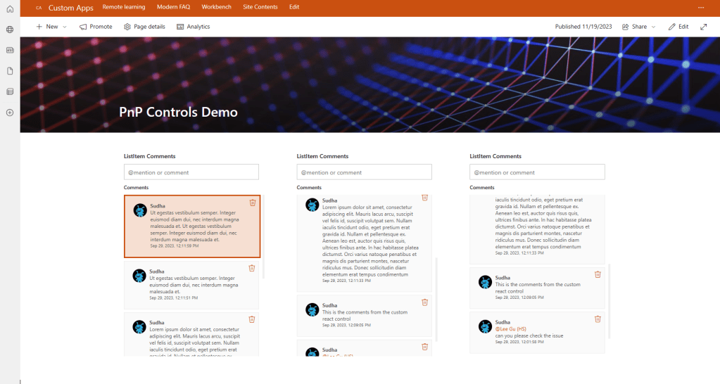
highlightedCommentId='6'
/>
</section>
);
};
export default ListitemCommentsDemo;
Below are the updates done to the file.
- Changed the class component to use react hooks
- Following are the properties that are mostly used
- listID – GUID of the list where the item comments has to be pulled.
- serviceScope – Current context service scope
- itemID – ID of the item where the comments has to be mapped.
- numberCommentsPerPage – Number of comments to be displayed per page.
- highlightedCommentId – Comment to be highlighted
Reference URL
ListItemComments – @pnp/spfx-controls-react
Sample Implementation
Conclussion
I hope you had learned something about one of the PnP controls. Still a lot to come in future. Stay tuned.
Please free to post your comments and let me know if you want me to post article on any particular feature or plugins that relates to SharePoint. Thanks for your support.
sudharsank/pnpcontrols-demo: Demo project on different PnP React Controls. (github.com)
Happy Coding…
 Knowledge Share